While you have all the agency to choose any paint color you want for your living room – I mean, it is your living room, after all – there are just some choices that are better off not made.
Some paint colors, while they may look good in your head, just won’t look good when put into a living room space – and it would be good sense to avoid them in painting your living room.
So, if you are about to go shopping for paint, here’s something you should check out!
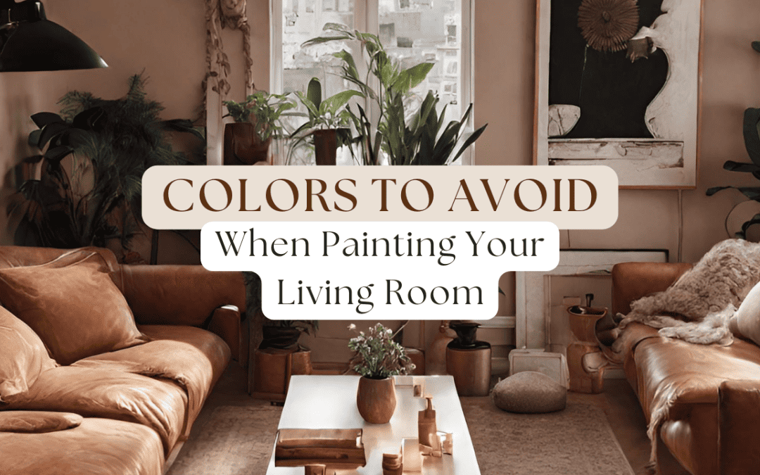
Here’s a list of Colors To Avoid When Painting Your Living Room.
1. Neon Colors
Bright, neon colors like electric blue, lime green, or hot pink are fun and preppy colors – but they can be overwhelming when put in a living room space.
While these shades are striking, they also tend to create a sense of restlessness and agitation rather than relaxation – which is essentially the kind of vibe you’re looking to achieve with your living room.
Living rooms are typically spaces where you unwind and entertain guests, and overly bright colors can detract from the welcoming and calming atmosphere you might want to achieve.
Why to Avoid:
- Overstimulates the senses, making it hard to relax.
- Difficult to match with furniture and decor.
- Can quickly go out of style, leading to earlier repainting.
2. Dark Colors
While dark colors like deep brown, charcoal, or black can add a touch of sophistication, they can also make a room feel smaller and more enclosed.
This is because dark colors tend to reflect lesser light, which then creates the feeling of a smaller, confining, and essentially a cave-like feel.
Dark colors also tend to feel gloomy and uninviting, which are two things you don’t want for your living room.
Why to Avoid:
- Makes the room feel smaller and more confined.
- Can create a depressing or overly serious mood.
- Requires more artificial lighting to brighten the space.
3. Red
Red is a powerful color, often associated with feelings of passion and energy – but, when put onto a living room, bright and saturated reds can feel too much.
Red is just too strong of a color, especially in a brighter and more tinted color, and it will easily overwhelm a space.
The color is also often associated with warmth, and when enveloped completely into a space, could make it feel unnecessarily hot.
Lastly, red can be a visually demanding color, making it challenging to coordinate with other elements in the room.
Why to Avoid:
- Too stimulating for a relaxing environment.
- Can overpower other design elements.
- Difficult to accessorize without clashing.
4. Certain Shades of Green
Green is often associated with tranquility and nature, but the wrong shade can have the opposite effect.
Neon greens or overly bright lime shades can feel unnatural and unsettling in a living space.
These tones can clash with other colors and create a jarring visual experience.
As an alternative, it’s better to stick with muted, natural greens that promote a sense of calm and harmony.
Why to Avoid:
- Can create a jarring, unnatural atmosphere.
- Difficult to match with other colors.
- May not complement the natural elements in the room.
5. Complex Patterns
While not a color per se, using complex paint patterns or wallpaper designs can be overwhelming in a living room.
Busy patterns, especially with contrasting colors, can make the space feel chaotic and cluttered.
Overall, it’s just going to be challenging to decorate around intricate patterns without making the room feel too busy or mismatched.
Why to Avoid:
- Will make the room feel disorganized and overwhelming.
- Overpowers the space, making it hard to focus.
- Limits decor choices and can clash with furniture.
While personal taste does play a significant role in choosing a living room color, it’s essential to consider the psychological and visual impacts of certain hues.
By steering clear of these potentially problematic colors, you can create a living room that is both aesthetically pleasing and comfortable for you and your guests.
Remember, the living room is a place for relaxation and socializing, and the color you choose should enhance these activities, not hinder them.
If you need professional help with your interior/exterior painting, Campbell Painting is here for you.
Our interior/exterior painting and washing services are available in Anchorage, AK.
Call us today at (907) 444-3657 for a FREE painting estimate.
Related: Paint Colors To Avoid For Your Exterior in Anchorage, AK
Guide To Fixing The Fading Paint On Your Home Exterior in Anchorage, AK

Ben Campbell is the proud owner of Campbell Painting LLC, a successful painting company based in Anchorage, Alaska. As a third-generation member of the painting industry, Ben has a deep-seated passion for his profession that started with his grandfather, who came to Alaska to sell paint. Born and bred in Alaska, Ben’s connection to his community is genuine and strong. Since 2006, he has been providing top-quality painting services, enhancing the beauty of Anchorage one building at a time. He also studied at Santa Barbara City College, solidifying his industry knowledge. Ben’s journey, including overcoming adversity, is a testament to his resilience and commitment to his craft, which is reflected in the success and reputation of Campbell Painting LLC.
Recent Comments